If you work with jersey design, you know the topic.
- There are regulations.
- Approval processes.
- Clear limits on what is possible.
And still, this is exactly where problems tend to arise.
Names and numbers are subject to strict regulations from organisations such as FIFA, UEFA and national leagues. These define readability, contrast, size and placement, and ultimately decide whether a design is approved for the pitch.
Most ideas don’t fail because of the design itself. They fail because they don’t meet the requirements behind it.
In this article, we take a closer look at what really matters in practice, and where there is still room to create something that makes your jersey stand out.
The reality: rules define the framework
Whether it’s FIFA, UEFA, the DFB or national leagues such as the DFL or Serie A, they all follow one clear objective:
👉 Players must be clearly identifiable at all times.
This applies to:
- referees
- opponents
- fans in the stadium
- and most importantly, television
That’s why certain aspects are non negotiable.
For example:
- numbers must be readable from distances of up to 50 metres
- they must clearly contrast with the jersey
- size, stroke width and placement are strictly defined
You usually feel this the moment a design goes into approval.
In the end, it’s not about what looks good. It’s about what works reliably under real conditions.
Why readability matters more than design
At first, many of these requirements feel restrictive. No decorative elements, no free experimentation, no “special” designs.
But the reasoning is simple:
👉 A match has to work under all conditions.
- in rain
- under floodlights
- in fast movement
- at distance
- on television
If a number is not clearly visible, it quickly becomes a real issue. For referees, for commentators and for the overall viewing experience.
That’s why one principle applies across all competitions: readability comes before design.
“No decoration allowed” – is that really true?

This is where things become interesting.
Anyone working with regulations knows the limitations:
- no advertising
- no brand integration
- no freely decorative elements
👉 But this doesn’t mean everything has to look the same. On the contrary, the most interesting approaches often emerge within these boundaries.
The regulations deliberately allow room for certain solutions, if you know how to use it.
This includes:
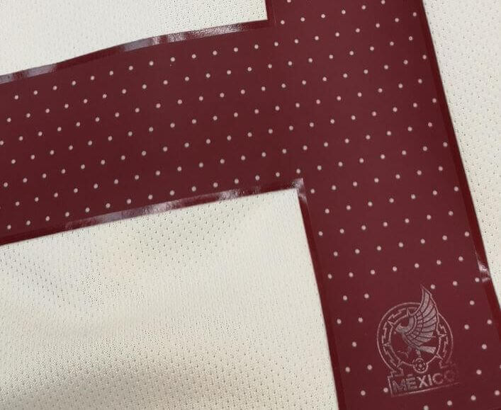
- perforations or breathable holes within defined limits
- segmented number structures
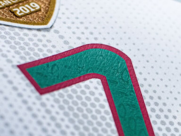
- shading, 3D effects or outlines to support readability
These are not tricks or workarounds. They are part of the system. This is where real design starts to happen.
What this looks like in practice
Understanding the rules is one thing. Applying them is another.
The real question is:
👉 How do you actually use these possibilities in design?
In practice, you see many interesting solutions.
For example:
single colour numbers with perforation
→ technically compliant while adding a visual detail that elevates the jersey
segmented numbers or floating elements
→ modern designs without compromising readability
matt and gloss effects
→ contrast and depth without adding colours
iriodin finishes or subtle patterns
→ details that only become visible up close
👉 These examples show one thing clearly: It is the details that make a jersey feel premium, without ever breaking the rules.
Are club logos allowed inside numbers

Many clubs work with small logos inside the numbers.
👉 This is not something that is simply allowed or forbidden.
In reality:
- some regulations allow small elements in defined areas and sizes
- others are much more restrictive
- in many cases, approval depends on the governing body
👉 In practice, this means: Every solution has to be checked and approved individually.
What defines good solutions today
When you look at modern jerseys, one thing stands out:
👉 The most interesting details often only become visible up close.
For example:
- matt and gloss contrasts
- fine material structures
- subtle effects in the light
- small details that create value for fans
All within the rules. And still full of character.
Why many jersey designs fail in practice
In practice, it’s rarely the ideas that cause problems. It’s the execution.
Typical issues you see again and again:
- insufficient contrast
- incorrect size
- designs that do not translate well into production
- regulations being considered too late
The consequences are familiar:
- last minute adjustments
- alignment loops
- delays
- or in the worst case, rejection
What FIFA, UEFA, DFL and others have in common
Whether it’s the Bundesliga, Champions League or international tournaments, the details may vary, but the underlying logic is always the same.
Readability is essential, design has clear limits, and television visibility plays a central role. At the same time, approval from the governing body is always required.
It’s not about designing freely, but about finding the best possible solution within a defined system.
Why experience makes the difference
Knowing the rules is one thing. Applying them correctly is another.
In practice, the same questions keep coming up:
- how far can a design be pushed without crossing boundaries
- which effects actually work on the jersey
- what will ultimately be approved
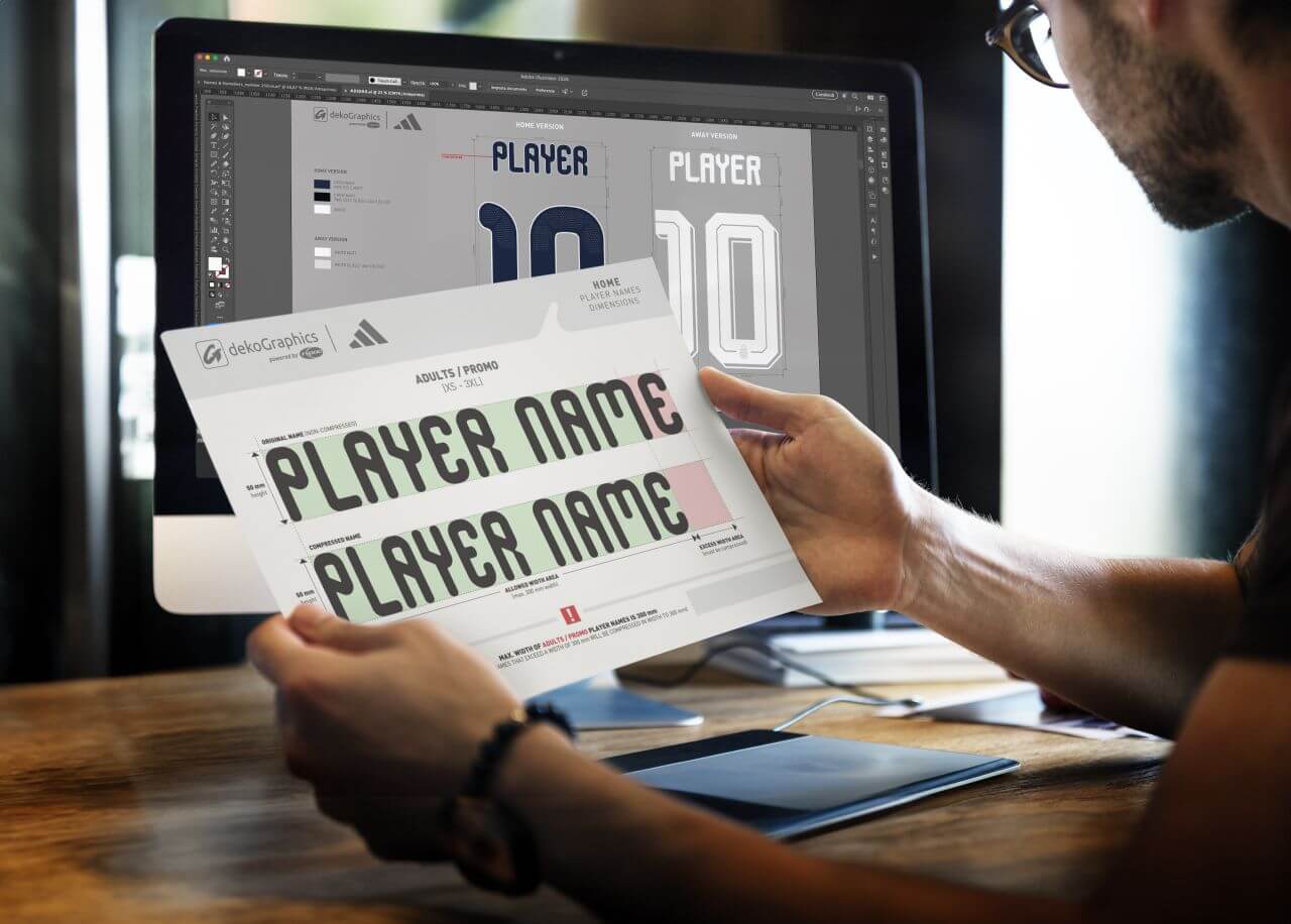
Another point that often becomes critical in practice is the submission of names and numbers to the federation or league.
This is where it becomes clear whether a design really works, or whether adjustments are still needed.From experience, we know that this step can lead to multiple alignment loops, especially if regulations were not considered early enough.
That’s why we regularly support our customers throughout this process, from alignment to final approval.
If you want to go deeper

If you want to explore the full range of possibilities for name and number design, we’ve created a detailed guide with further examples and approaches:
👉 THE ULTIMATE GUIDE FOR MERCHANDISERS: CREATIVE DESIGN OF NAMES AND NUMBERS
In this guide, you will find:
- different design options
- practical examples
- and ways to combine effects effectively
FAQ: common questions about jersey number regulations

Are logos allowed in jersey numbers? Partially. Some competitions allow small logos under strict conditions, while others do not. Each case needs to be assessed individually.
Can I use multiple colours in a number? In many cases, numbers are limited to one main colour. Additional effects are only possible if readability is not affected.
Are effects like gloss or iriodin allowed? Yes, as long as they do not interfere with functionality or violate regulations. This is where many creative solutions are created.
Why are the rules so strict? Because jerseys have to function during the game. Clear identification is essential.
When should I consider the regulations? As early as possible. If you check too late, you risk changes or rejection.

Conclusion: great jersey design happens within the rules
Jersey numbers are not a free design space. They are part of a system that has to work on the pitch, in the stadium and on screen.
Regulations set clear boundaries. And those boundaries define what is possible.
The real challenge is not creating a design that looks good. It is creating one that actually works within these rules.
Once you understand that, it becomes clear: creativity does not disappear. It shifts.
- Into materials.
- Into details.
- Into solutions that are not immediately visible.
And that is where the real difference is made.
TRUSTED BY


