Virtus Bologna stands for a clear, defined look in basketball, black, reduced to the essentials.
And that is exactly what makes every new jersey a challenge.
The more reduced a design is, the more weight lies in every single detail.
There is nothing to hide behind. No bold colours, no loud graphics. Only the interplay of material, structure and function.
The goal for the new jersey was clear:
A completely new design – one that still fits seamlessly into the identity of the club.
A basketball jersey that performs on the court and connects with the people wearing it.
THE CHALLENGE
Minimalist designs leave no room for compromise.
Without strong contrasts or dominant graphics, every single element affects the overall perception.
The requirements were clear:
- Logos need to be visible without dominating
- Numbers must perform under all conditions, on court, on screen and for the fans
- Details should feel premium without disturbing the clean look
At the same time, the goal was not to change the identity of Virtus Bologna. The challenge was to refine it with precision, while introducing new visual, functional and digital elements.
THE SOLUTION
The solution did not come from one single feature. It came from combining different technologies, each with a clear role.
Working closely with the club, we focused on the areas where small adjustments create a noticeable impact:
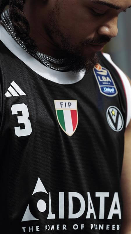
#1 Club crest – LENTEX® | FLY EYE
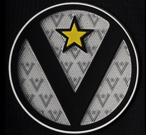
The Virtus crest was developed using LENTEX® | FLY-EYE, a technology that creates depth through a fine lens structure.
- subtle floating effect
- changes slightly depending on the viewing angle
- stronger presence without adding colour
It is not something you analyse, but something you notice immediately.
#2 FIP badge – contrast through material
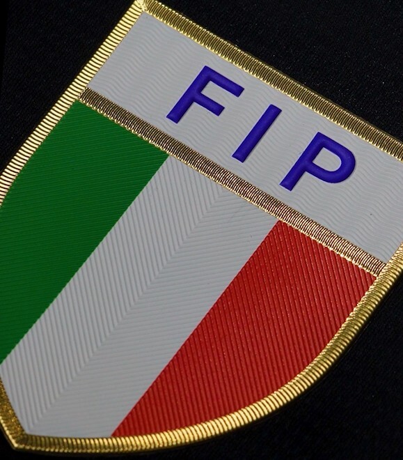
The FIP badge was produced using 3D HF TPU, combined with a subtle metallic finish.
- contrast comes from material, not colour
- light reflection creates visibility
- clean separation without distraction
This creates a balance between movement and calm areas on the jersey.
#3 Authentic label – physical meets digital
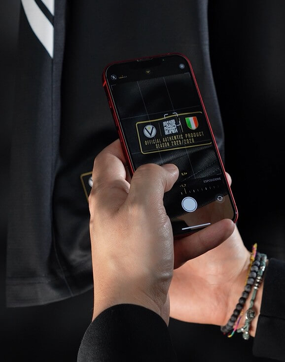
The authentic label goes beyond traditional branding.
With 3D SILICONE I MULTILEVEL, it creates real depth you can both see and feel. At the same time, an integrated QR code connects the jersey to digital content.
- multi-layer structure
- precise execution of small details
- QR code as a gateway to additional content
A small element that extends the jersey beyond the fabric.
#4 Names and numbers – function with added detail
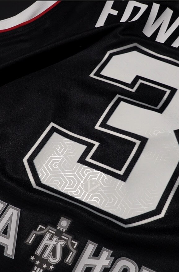
For player names and sponsor logos, Virtus Bologna uses ECOBLOCK BLACK.
- clear readability in all situations
- strong durability
- consistent quality across all applications
To go one step further, a subtle pattern was added to the back numbers with ECOLBLOCK BLACK | MATT GLOSS.
- visible only under certain lighting conditions
- adds depth to the surface
- gives the numbers their own character
The result, numbers that stay clear, but feel more unique.
The importance of the overall composition
The real difference does not come from individual elements.
It comes from how they work together:
- matte and glossy surfaces
- structured and smooth materials
- static and dynamic effects
This combination creates a jersey that feels consistent and well considered.
THE RESULT
The final jersey stays true to its identity. And that is exactly what gives it strength.
From a distance, it looks clean and reduced. Up close, a different level of depth becomes visible:
- different materials
- subtle highlights
- functional and digital elements
It does not try to be louder. It simply works better, in every detail.
KEY TAKEAWAYS
The Virtus Bologna project shows what really matters in reduced designs:
- Less design does not mean less work
- Details make the difference
- Technologies work best in combination
Or simply put:
👉 When everything is reduced, every detail matters.
TRUSTED BY


