“What’s new?” is one of the most common questions we hear from clubs, brands and production teams – especially when the next jersey or the next collection is starting to take shape.
And honestly: it’s a fair question — but it often points in the wrong direction.
Of course, we’re constantly working on innovation — and yes, new techniques and new effects do enter the market.
But with 150+ heat transfer options in a portfolio, “new” doesn’t automatically mean a completely new technique every year. What really happens in practice is something else: the role of logos is changing. And with that, the expectations change too — around material feel, application, scalability, consistency, and increasingly: digital functionality.
In short: the logo isn’t being reinvented. It’s being rethought.
Why “What’s new?” is often the wrong question (but still the right starting point)
Most customers don’t ask what’s new because they’ve already tried everything. They ask because they feel the rules have changed:
- products must stand out more
- fans and consumers have become more demanding
- releases happen faster and more frequently
- and “standard” looks replaceable much quicker than it used to
So “new” usually doesn’t mean “newly invented”. It means:
- New for our design.
- New for our branding.
- New for our next project.
And this is where it gets interesting: We don’t answer “What’s new?” with a list of 20 new effects. Because in the end, it doesn’t really matter whether something is “newly invented”. What matters is whether it actually makes a difference for your next project.
And when we look at what’s happening in real projects right now, it becomes pretty clear what brands and clubs are truly asking for. Here are 7 trends that matter in 2026:
Trend #1 – 3D SILICONE becomes a material system
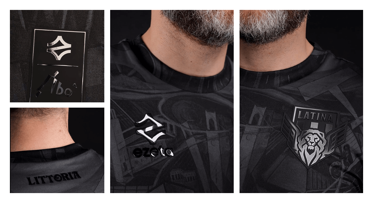
3D SILICONE is no longer “just a 3D effect”. In 2026 it’s increasingly used as a material world — a system that combines design, touch, detail, repeatability and scalability.
This is especially visible in professional football. The club crest moves to the beginning of the process — not the end. Why? Because the crest decision often sets the direction for additional elements such as:
- neck labels
- authentic labels
- special and anniversary badges
- and sometimes even digital add-ons
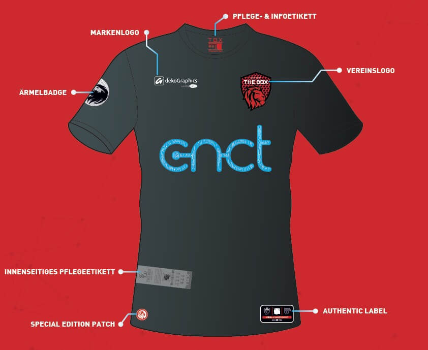
Many clubs want to move away from a “patchwork” of five different techniques. Instead, they aim for a clear logic: brand-defining elements in one consistent material world — functional elements like Names & Numbers and sponsor logos kept intentionally flat.
This balance (3D for highlights, flat for sponsor logos and names & numbers) is also part of our jersey logic: a professional jersey consists of multiple elements, and the modern look often comes from the contrast between 3D highlights and flat components.
Mini-case from the field
A club is planning a new jersey. The design direction is decided quickly — and then the typical questions come up:
“What about the crest, the neck logo, the authentic label?”
If these elements are produced in different techniques, complexity grows behind the scenes: different application parameters, different feel, different production logic.
If the crest becomes the “anchor” in 3D SILICONE, many brand-defining elements can stay within the same material world — with variations in surface, levels, effects or structure. This creates calm, even for re-orders and future extensions.
Trend #2 – Logos become touchpoints: NFC/QR is growing up
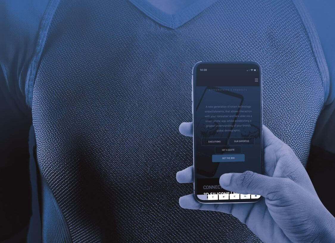
Connected features are no longer treated as a gimmick in 2026. They’re becoming product logic: authenticity, fan engagement, activation and data.
Important: this isn’t about “putting technology on a jersey”. It’s about the fact that a jersey — and especially a crest — is one of the strongest brand touchpoints: visible, emotional, and present for years. That’s exactly why it becomes a natural bridge into digital.
This is where our Connected Jersey approach comes in: a jersey can move from a pure merchandise product to a digital touchpoint.
What we see becoming more mature:
- use case over gimmick: content, rewards, authentication, community, activation
- quiet integration: QR/NFC/RFID embedded in logos/labels — design stays design
- measurability: sponsors want more than visibility; activations become KPI-ready
- pilot mindset over “big programme”: start small, learn, scale
Mini-case from the field
A club launches a special edition jersey. In the past, the story ended with the sale. Today it often starts there.
The result: higher engagement on social media, more conversation value — and sponsors can become part of the activation, not just “a logo on the sleeve”.
Trend #3 – Hybrid & layering: premium looks through material combinations

When customers ask “What’s new?”, the answer in 2026 is often not “a new technique”.
It’s a new look.
Because differentiation today rarely comes from completely new techniques. It comes from material combinations, layering and carefully chosen finishes. Especially on social media, logos are judged in close-ups: details, surfaces, texture, depth. What used to be “good enough” can look replaceable very quickly.
What we’re seeing more often in 2026
Instead of “one technique for everything”, many clubs and brands now use hybrid solutions — combining different materials in a very intentional way:
- textile backings for more character and a premium feel
- matt/gloss contrasts, satin vs texture, soft-touch vs metallic accents
- layering (e.g. 3D elements plus fine printed details)
- special effects that don’t scream, but subtly elevate the look
The key is not “more” for the sake of it.
It’s about smart accents that make a design feel premium — without making it look busy.
A strong example: 3D SILICONE X FABRIC
One hybrid solution we see more and more is 3D SILICONE X FABRIC. The idea is simple — but extremely effective:
You keep the clarity and precision of 3D SILICONE and you completely change the character of the logo through the textile backing.
Depending on the fabric, the logo takes on a very different personality:
- Tatami: sporty, technical, structured
- Satin: tonal, elegant, premium
- Woven: robust, heritage, authentic
- Microfibre: soft, modern, clean
And that’s a real advantage in 2026: you can create different moods within the same design concept — without overloading the jersey or the product.
Mini-case from the field (hybrid)
A club is working on a tonal anniversary jersey. The crest should feel premium — but not too dominant. A classic embroidered crest would be possible, but tonal embroidery can easily look too busy and lose elegance in close-ups.
With a hybrid like 3D SILICONE X SATIN, you get a premium result: fine details, clean edges, calm material aesthetics — yet still enough depth to stand out in detail shots.
The outcome isn’t louder. It feels more intentional, more premium — and clearly more modern.
Trend #4 – Limited drops need serialisation & real individualisation

“Limited” only works if it truly feels limited.
In 2026 we clearly see collector logic increasing — in football (special jerseys, anniversary drops), but just as much in fashion, sportswear and collaborations.
What actually makes a difference:
- visible serial numbers (“#37/500”)
- personalised elements (edition, location, date, hidden message)
- authenticity elements that don’t feel “added on”, but integrated into the design
Mini-case from the field
A brand plans a capsule collection with a limited run. The design is strong — but it lacks the proof-feeling that it’s genuinely limited.
A visible serial number turns a product into a collector’s item. And with QR/NFC, that serial number can be digitally extended: authenticity, story, behind-the-scenes access.
The key point: personalisation needs to be planned in early — not as a last-minute idea once the design has already been signed off.
Trend #5 – Logos become data points: DPP & RFID move into branding
This trend is very pragmatic. Many businesses lose time and money every day because stock levels are inaccurate, processes are manual, and transparency is missing.
That’s why RFID is being discussed more often in 2026 where it wasn’t discussed before: in branding. Because branding already exists on every item — and it can become the carrier of digital identity.
Our RFID approach describes the core problem clearly: without digital identity, items remain hard to find, hard to control and hard to track — RFID solves that. And we intentionally position the entry as realistic: branding + RFID + system integration, not an “IT monster project”.
The right way in is a pilot: pick a scope, define the solution, choose hardware, plan integration, test.
Mini-case from the field
A brand has multiple warehouse locations and a growing e-commerce share. Stock counts are painful: count, correct, explain.
RFID turns this into a clean process: items are captured automatically, inventory becomes reliable, out-of-stock drops, replenishment becomes smarter.
The key point: if RFID is integrated via labels/branding, it doesn’t become an “extra project” — it becomes part of the product logic.
Trend #6 – Smart fashion / smart workwear: function becomes part of branding

Smart clothing isn’t just tech fashion. In workwear, corporate wear and performance wear it often comes down to very practical needs:
- identification and assignment
- access to information (care, safety, product data)
- lifecycle logic (replacement cycles, asset tracking)
- authenticity and anti-counterfeit (especially for premium and limited products)
NFC is one of the most accessible solutions because the interaction is simple: tap with a smartphone — done. And it can be integrated into a logo without compromising the design.
This is what our Connected Merchandise logic is about: connecting physical products with digital information and experiences via QR/NFC/RFID — turning textiles into interactive touchpoints.
Mini-case from the field
A workwear brand wants fewer service questions and more control over product information.
With NFC in the branding, care instructions, replacement links, safety information or internal checklists can be accessed directly — without hangtags, extra labels or apps.
For the end user it stays “just clothing” — only with a digital shortcut that genuinely helps.
Trend #7 – Special effects for flat logos: because “flat” doesn’t have to be boring

Not every project needs 3D. Many applications need the opposite:
- lightweight
- flexible
- performance-friendly
- flat
- comfortable even on thin or technical fabrics
At the same time, customers still expect “more” — just in a subtle way: matt/gloss contrasts, soft shimmer finishes, embroidery-look transfers, UV/temperature/wet-sensitive effects.
The trend isn’t “bling”. It’s: Differentiation without sacrificing comfort.
Mini-case from the field
A performance product needs a flat logo because anything raised would feel uncomfortable or too heavy. But it still needs to look premium.
A matt/gloss contrast or a subtle shimmer finish instantly upgrades the look — without adding thickness.
Function stays intact (stretch, comfort, washability) — and the logo still has character.
The better answer to “What’s new?”
When you look at these 7 trends side by side, one pattern becomes obvious: in 2026, it’s less about having more options — and more about thinking of logos as part of a system.
And that’s exactly why the best answer to “What’s new?” isn’t technique #151 — it’s a new way of thinking.
Because when customers ask what’s “new”, they rarely mean: “Show me another technique.”
What they usually mean is:
- How do we achieve a look that feels truly up to date in 2026?
- How do we reduce complexity and changeovers when more elements are added later?
- How do we make our product future-ready — for drops, digital features, DPP and retail?
And that’s why it makes sense to shift the conversation: New doesn’t automatically mean a new technique. New means: new requirements, new use cases and a new system logic.
If you want to go deeper:
We’ve structured these topics in our Hub Pages — depending on what you’re working on right now:
- Jersey setup & the 3D/flat balance: “Customize Your Jersey”
- Fan engagement & activation (clubs): “Connected Jersey”
- Connected products for brands (NFC/QR/RFID in branding): “Connected Merchandise”
- Digital Product Passport (DPP) & transparency: “Digital Product Passport (DPP) in textiles”
- Digital data flow & processes (supply chain / inventory / warehousing): “RFID solutions”
Conclusion: What’s actually new in 2026?
In 2026, it’s not about “one more technique”.
What’s new is how logos are used — and how they fit into a bigger system.
If you’re looking for the right direction for your next project, the most important step isn’t having more options — it’s making a clear selection: 2–3 solutions that truly fit your specific application, instead of 150 possibilities on paper.
If you’d like, we’re happy to support you — from the first design idea and the right technique combination all the way to production-ready implementation, including connected features where it makes sense for your project.
TRUSTED BY


