Yes, a logo can look completely different on your screen than it does on the finished garment.
In most cases, that isn't because of a poor artwork file or inaccurate production. It's because certain embellishment techniques only reveal their true character through light, movement, or the way they feel in your hand.
That's why renderings and product visualisations are essential throughout the development process, but they can't fully replace a physical sample.
Maybe you've experienced this before:
Your team has spent weeks developing a new collection or preparing for the launch of a new jersey. The logo has been approved. The colours are perfect. The rendering looks exactly the way everyone imagined.
Everyone agrees:
"That's it. That's what the final product should look like."
Then the first sample arrives.
And suddenly...
The logo looks different.
Not worse.
Just... different.
We see this happen all the time with fashion brands, sportswear manufacturers and professional football clubs alike. And the surprising part is this:
The issue usually isn't the design. And it isn't the production either.
The difference comes down to one simple fact:
Our brains experience digital images and physical materials in completely different ways.
A file shows shapes. A sample creates an experience.
Almost every embellishment project starts digitally.
A logo is supplied as a vector file. Early concepts are reviewed as PDFs. Jerseys and garments are presented as realistic renderings long before production begins.
That's exactly how it should be.
Renderings help you:
- compare different design ideas,
- fine-tune colours,
- define logo placement and sizing,
- and make informed decisions early in the development process.
Our designers spend a great deal of time creating artwork that reflects the final product as accurately as possible. The goal is simple: to give you a realistic impression before production even starts.
And in most cases, they do a remarkably good job.
Colours, proportions and shapes can all be reproduced with impressive accuracy on screen. What a screen can't fully communicate, however, is something much more subtle:
How premium a product actually feels.
Why our brains judge physical products differently than digital images
When we look at a logo on a screen, our brain is processing only a limited amount of information.
Mainly:
- colour
- shape
The moment we hold a real garment in our hands, everything changes.
Suddenly, our senses start asking completely different questions:
- How does the material feel?
- Does the surface have texture?
- How does the logo react when light hits it?
- Does it create depth?
- Does it reflect?
- Does the appearance change when the fabric moves?
Only when all of these impressions come together do we begin to perceive a product as premium, sophisticated or luxurious.
That's why a logo that looks fairly understated on screen can suddenly feel incredibly premium once it's applied to the actual garment.
And the opposite can happen as well.
A finish that looks dramatic in a rendering may appear much more subtle in real life.
Both are perfectly normal.
Renderings have limits

Renderings and product visualisations are an important part of every development process.
They help teams to:
- compare different design concepts,
- fine-tune colours,
- define logo placement,
- and make confident decisions early in the project.
But even the best rendering has its limitations.
A screen can accurately display colours, shapes and proportions.
What it struggles to capture are things like:
- light reflections,
- material textures,
- depth,
- movement,
- and tactile qualities.
And that's exactly where the biggest differences between a digital artwork and the finished product often appear.
Some effects depend on light

Metallic and reflective embellishments are a good example.
Technologies such as:
- PRIST®
- MIR®
- Reflective Transfers
- Iriodin Effects
change their appearance depending on how light interacts with the surface.
A photograph only captures a single moment. In reality, perception changes constantly. Depending on the light source, viewing angle or environment, the same logo can look completely different.
That's why we often see customers pick up a physical sample and immediately become far more impressed than they were after seeing the initial rendering.
Some effects depend on movement

The difference becomes even more noticeable with technologies that react to movement.
LENTEX® is a perfect example.
Depending on the version, it can:
- Change colours
- Switch between images
- Create depth effects
- Simulate movement
The challenge is simple: a photo cannot show movement. Even a video only captures part of the experience.
That is why lenticular technologies are often difficult to fully appreciate until you can hold the product yourself and view it from different angles.
Some effects depend on touch

With other technologies, light and movement are not the main factors.
The real difference comes from the surface itself.
For example:
- 3D SILICONE
- Tatami Effects
- Satin Effects
- Embroidery-Look Transfers
- Studs & Stones
On your screen, some of these embellishments may appear quite similar.
But the moment you hold them in your hands, the differences become immediately obvious.
- The texture
- The depth
- The material feel
- The perceived quality
These are things that photographs can only capture to a limited extent.
And sometimes it's exactly the opposite
Of course, the opposite can happen as well.
Some embellishments look especially dramatic in artwork presentations or product photography. Once applied to the finished garment, however, the effect may appear much more subtle.
There's nothing wrong with that. It's simply something you should know before making a decision.
That's why we like to discuss these points early in the development process. It's much easier to evaluate a physical sample together than to discover later that the finished effect looks different from what you expected.
That's why renderings and physical samples go hand in hand

Of course, this doesn't mean you have to develop your next jersey or collection blindly.
Our designers create artwork concepts that aim to represent the final appearance of your logo as realistically as possible. This allows you to compare different ideas, evaluate options and make informed decisions early in the process.
Even so, a rendering can only tell part of the story.
How to choose the right embellishment before production begins
If you're deciding between two or three embellishment techniques, the real question usually isn't:
"Which technique is the best?"
It's:
"Which technique will create exactly the look and feel we want on our garment?"
And that's a question that often can't be answered on screen alone.
That's why we deliberately work in several stages throughout the development process.
- First come the ideas and renderings.
- Then, depending on the project, we produce physical samples.
Only once both align do we move into production.
This approach may require a little more time at the beginning of a project. But it often saves significantly more time, cost and uncertainty later on.
Why many customers start with our sample box
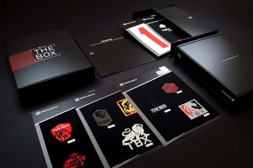
Many of our customers face the same challenge at the beginning of a project.
- They already know the impression they want their logo to create.
- What they don't know yet is which embellishment technique will achieve that effect most effectively.
That's exactly why we created THE BOX.
Rather than showcasing individual customer designs, our sample box is designed to help you experience different embellishment technologies firsthand.
At this stage, that's what really matters.
For example:
- What does a 3D SILICONE logo actually feel like?
- How does a Matt-Gloss finish look in natural daylight?
- How does a reflective logo change under different lighting conditions?
- What does a lenticular effect look like when the garment is moving?
Many of these differences are difficult to appreciate in photographs or renderings.
The most important step comes next
THE BOX answers one fundamental question:
Which direction should we take?
Once that's clear, the most important part of the development process begins:
- This is where we create a sample based on your actual logo.
- Applied to your chosen fabric.
- Under the same conditions in which the final product will be worn and used.
Only then can you truly evaluate:
- whether the embellishment works in harmony with the fabric,
- how colours appear on the material,
- how the surface behaves,
- and whether the overall result creates exactly the impression you're aiming for.
Because in the end, the goal isn't to create an impressive sample.
It's to create a finished product that delivers exactly what your brand promises.
Checklist: When should you request a physical sample?
A rendering is often sufficient when you're evaluating colours, sizing, placement or simple flat logos.
However, we strongly recommend requesting a physical sample if one or more of the following applies:
✅ Your logo includes metallic or reflective effects.
✅ The embellishment changes through movement (for example, lenticular technologies).
✅ Texture or tactile feel is an important part of your brand experience.
✅ You're deciding between multiple embellishment techniques.
✅ The garment uses a unique fabric or surface construction.
✅ The product is part of a premium collection or an important jersey launch.
✅ You want to minimise the risk of making the wrong decision before production begins.
The more of these points apply, the more valuable a physical sample becomes.
Frequently asked questions

Is a rendering enough for final approval? For many projects, yes. However, if your design includes specialty finishes or relies heavily on material effects, we recommend reviewing a physical sample before giving final approval.
Why do metallic logos often look different in photographs? Because a photograph captures only one fixed moment. In reality, metallic and reflective surfaces constantly change their appearance depending on the lighting and viewing angle.
Why do some 3D logos feel much more premium on the finished garment? Depth, texture and tactile qualities can only be represented to a limited extent on screen. These characteristics are fully appreciated only when you see and touch the finished product.
Does a difference between the rendering and the physical sample mean something went wrong? No. In many cases, the sample simply reveals characteristics that cannot be accurately represented in a digital visualisation—such as reflections, texture, depth or movement.

Conclusion: The best decisions aren't made on screen alone
Renderings, PDFs and product visualisations are essential tools in today's product development process.
They help bring ideas to life and support informed decision-making from the earliest stages.
At the same time, some characteristics simply can't be fully communicated digitally.
- Light.
- Movement.
- Material.
- Touch.
These are often the qualities that define how premium an embellishment feels once it's applied to the finished garment.
That's why we always see renderings and physical samples as complementary—not competing—tools.
- A rendering helps you choose a direction.
- A physical sample gives you the confidence that your decision will perform just as well in reality as it does on screen.
Because no one decides whether a product feels premium by looking at a PDF. That decision happens the moment you hold the finished garment in your hands.
How do you make your decisions?
Do you mainly rely on artwork and renderings during product development? Or do you validate important embellishments with physical samples before production begins?
If you'd like to experience different embellishment technologies side by side, THE BOX is a great place to start.
And once you've found the right direction, we'll work with you to develop a custom sample featuring your own design, applied to the exact material your final product will use.
TRUSTED BY


